Step 4:
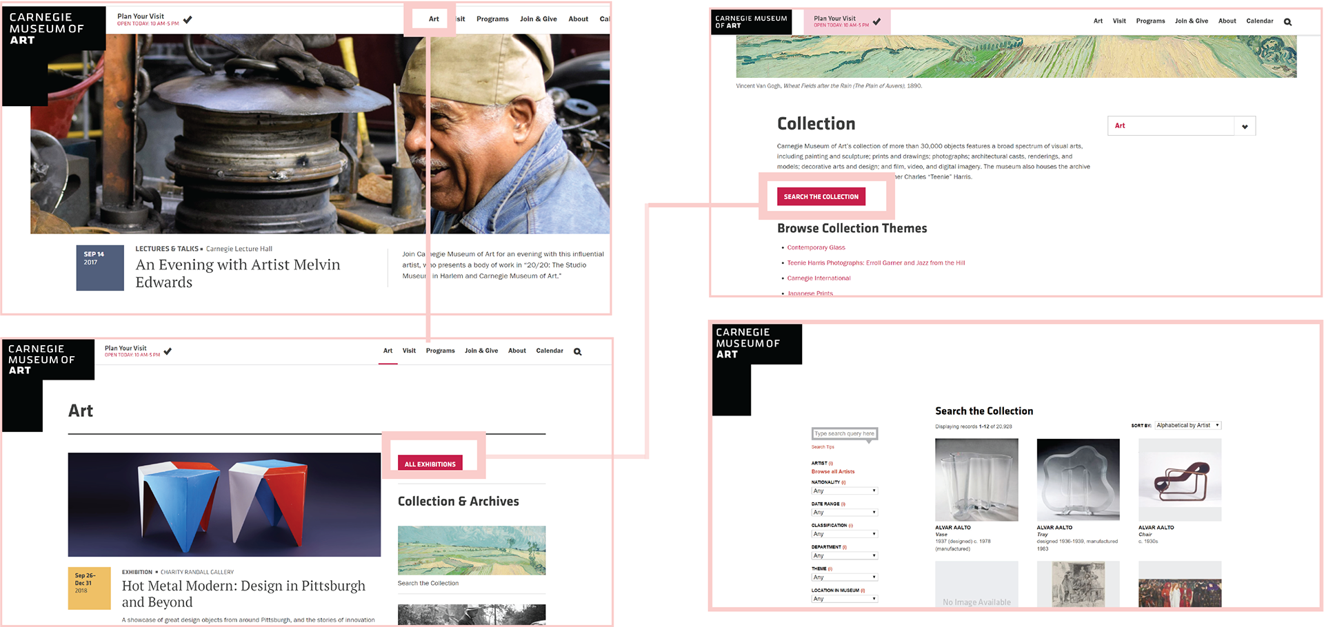
When a user first comes into contact with the CMOA website, they are immediately met with a feature photo of whatever they'd like their visitor to see first. While large, the feature photo acts as a sort of buffer between the navigation bar and the rest of the feed. This allows for two types of navigation through the website: "wander-oriented" or "target-oriented". If I am unsure about what I would like to get out of the website, I could easily scroll through the feed until something piques my interest. Alternatively, if I had a destination within the site, I could travel there through the assistance of the navigation bar.

After my initial research, my most prevalent concern was navigation when it came to analyzing the digital thresholds of the website. To simplify my search, I truncated my search into two paths: a general search vs a specific. The term "general" is used loosely here to describe a potential user who is not quite sure what they will find at the museum or even what they are interested in.
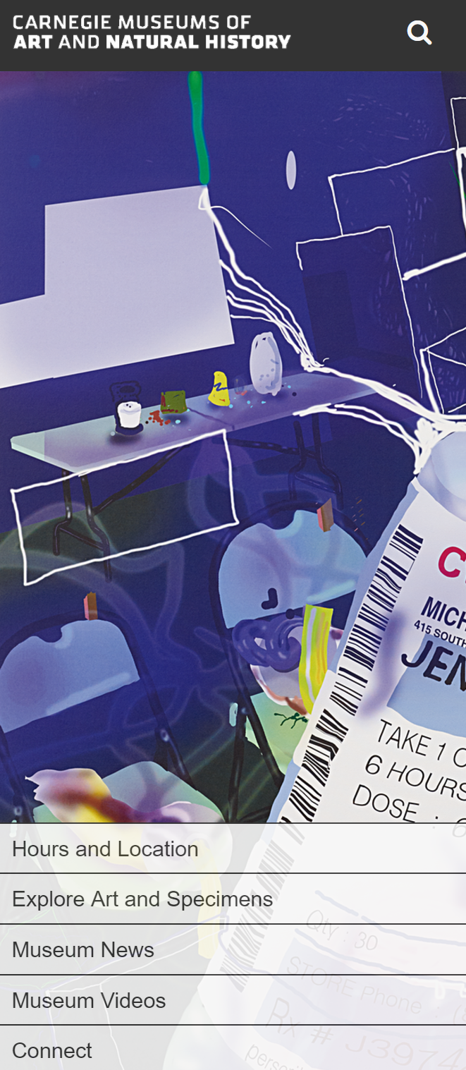
As someone who does not have an apple device, I couldn't use the mobile app. Thus my only resource for navigating the museum seemed to be limited to this mobile site. Upon further inspection, I discovered a browser version of the app, but had to look with quite a bit of scrutiny, significantly more than I presume the average museum go-er would. That being said, the app itself did not help as much as I needed to in my pursuit of a specific art piece.
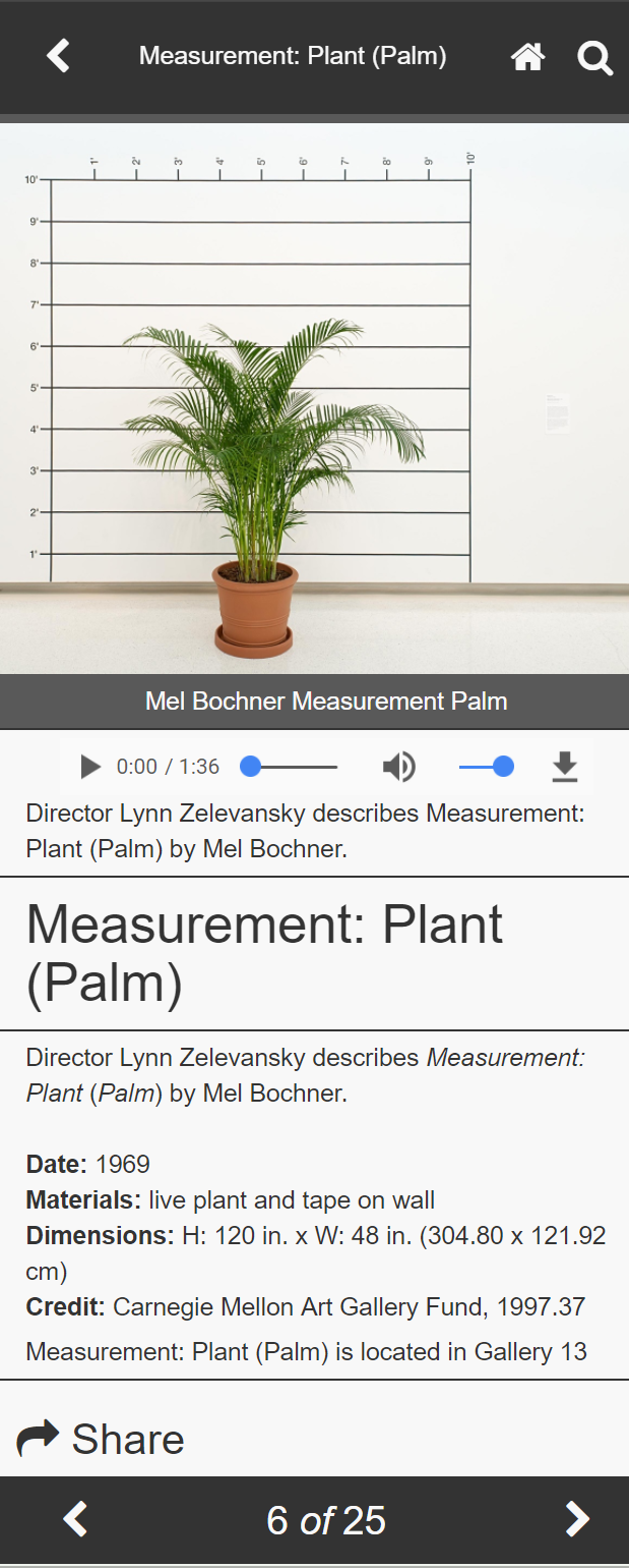
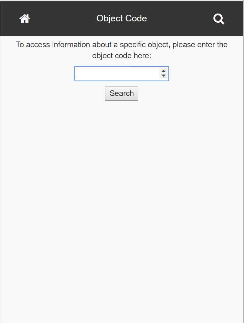
The app requires object codes that are nowhere to be found anywhere on plaques. It is vestiges like this that indicate there have been attempts to integrate physical with digital experiences.

Step 5a:
(a)After getting comfortable with the museum physical and digital site, I am now equipped to synthesize what I’ve learned.
(i) The digital resources were intended for users to reference in two different modes: “target-oriented” vs. “non-target-oriented”. Essentially, the app seemed to be put to better use at the museum. Contrastly, the website seemed to be more effective as a visit-planning tool, a resource you would use before actually stepping foot in the museum.
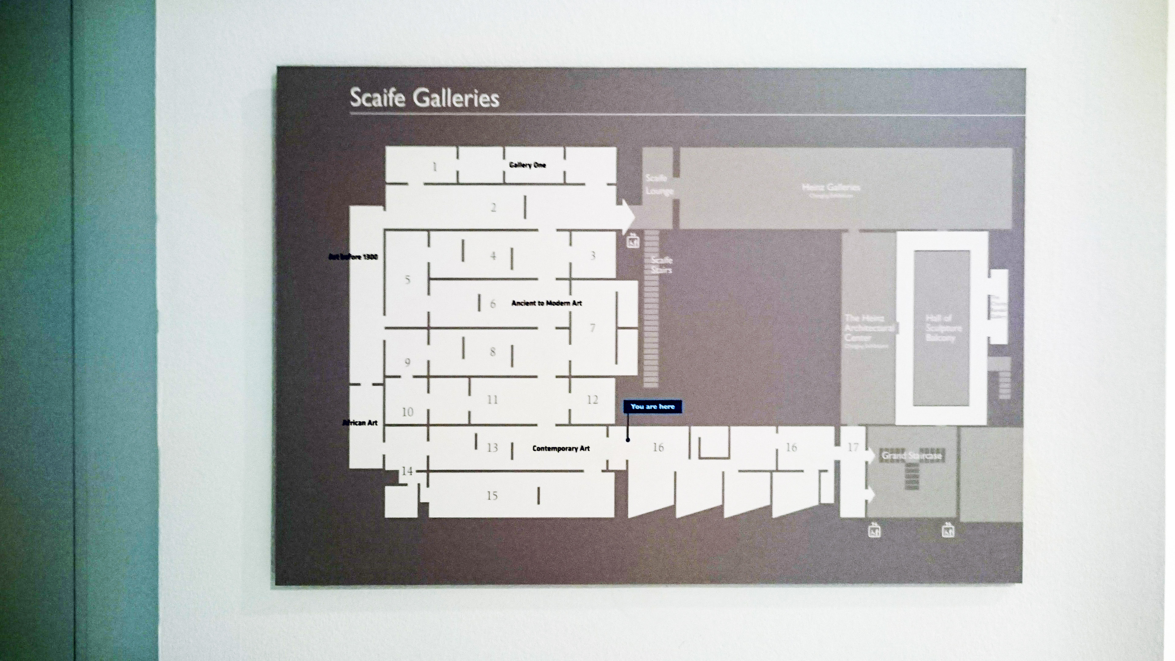
(ii) The museum guided the physical experience with not only piece placement, but also with space architecture. Many doorways/entrances required a user to slow down and traverse a narrow path, such as the path from driveway to main courtyard, coat room to lobby space, CMNH to CMOA, etc. These elements required people to quite literally slow their pace to continue through the narrower space. As a result, the change of speed amplifies a user’s experience once they enter the main space (lobby, exhibit, front courtyard).
(iii) When it comes to crossing thresholds, the digital platforms are very sequential (one page leads to another). Contrastingly, the physical museum is designed in a way to encourage wandering: a user’s path is not concrete and laid out for them. Because of this, a physical visit to the museum has more factors that contribute to the experience than a digital. Things like other visitors, weather, and ambient factors can all affect a visitor’s wandering through the museum. People were less inclined to wander freely throughout exhibits if other people were already occupying it. Through the website and the app, these external factors don’t exist.