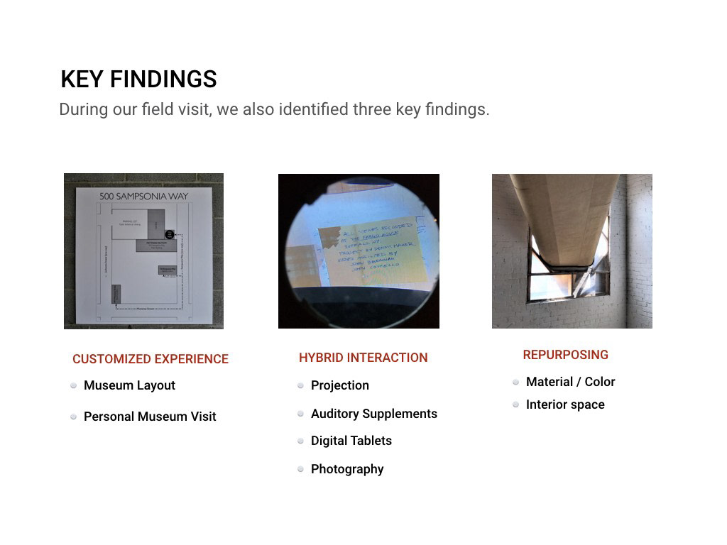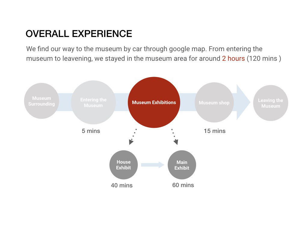
visual representation of our plan of action when conducting Mattress Factory research
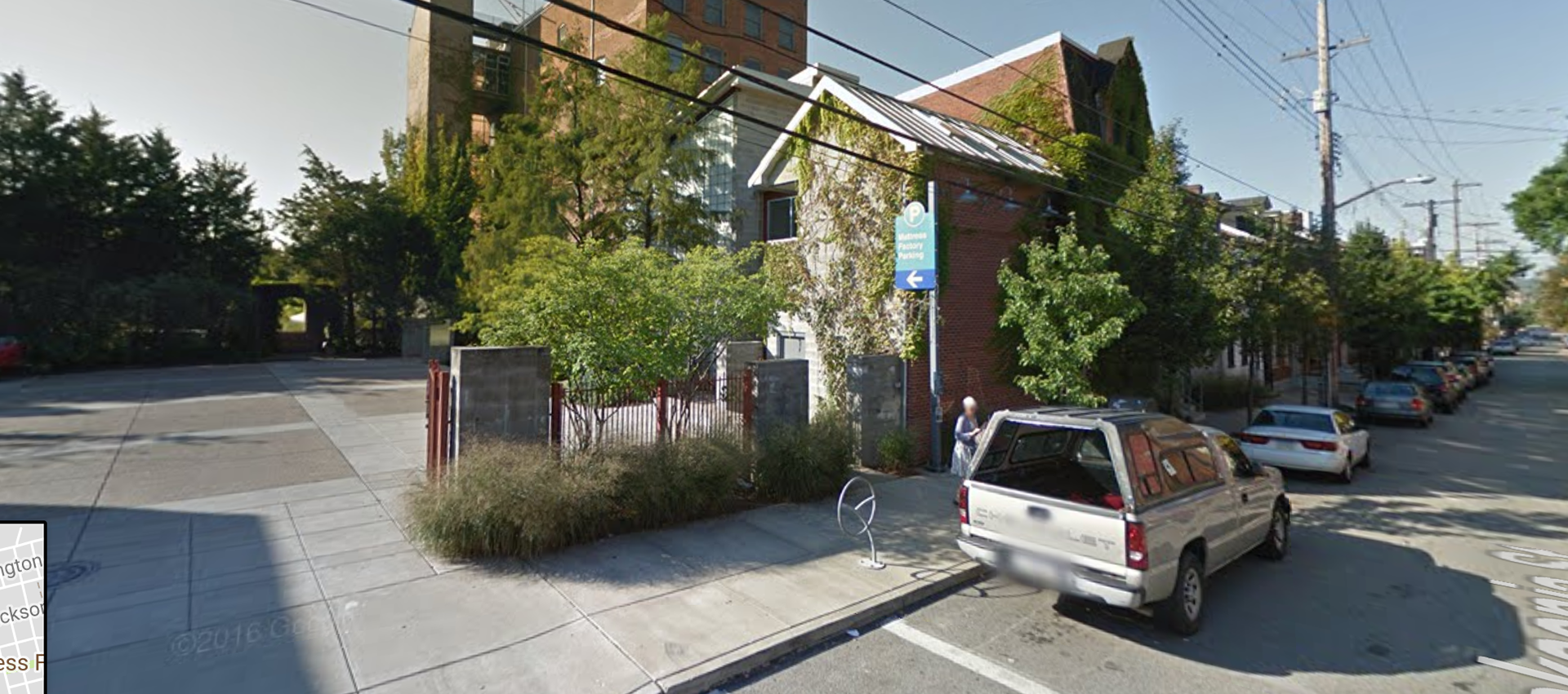
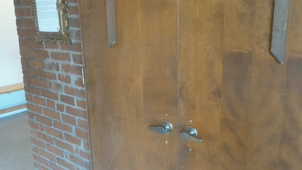
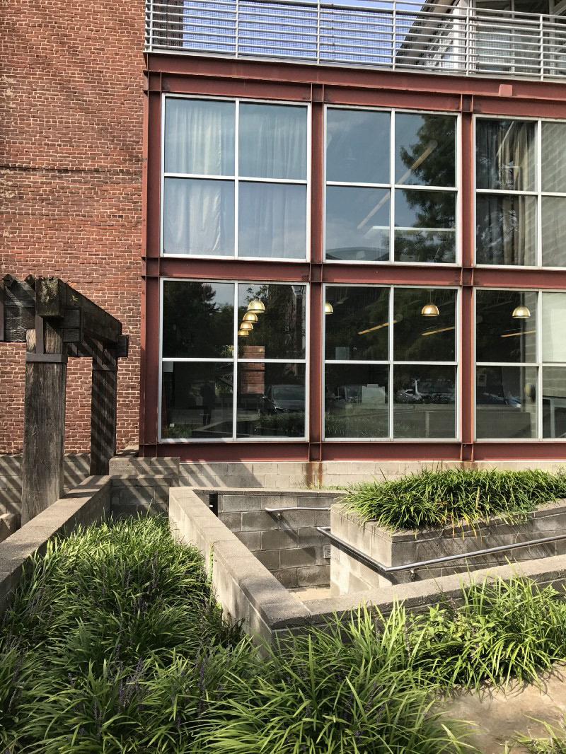
Utilizing the google map navigation system, we drove to the Mattress Factory and parked in their designated lot. We were greeted earliest by the green and blue “Mattress Factory Parking” signage, thus indicating that we had arrived at our target destination. The exterior of the museum is constructed of mostly red bricks, consistent with the surrounding architecture style. As a result, the museum’s outside appearance nearly blends into the neighborhood with very little communicating that it is a museum. So from the outside, it will be hard to recognize as museum without the small signage. A visitor traverse a threshold from public to private museum space once crossing over into the parking lot. This is aided by signage and change in ground material from pavement to gravel. A path acts as a guide to visitors to a semi-closed area, shaded by a white canopy. This creates a liminal space between the lot and the museum, neither inside nor outside. The change in overhead height and brightness act as a threshold for visitors to traverse. Scattered within the space were some tables and chairs, presumably used for special museum events or parties.
Entering the museum
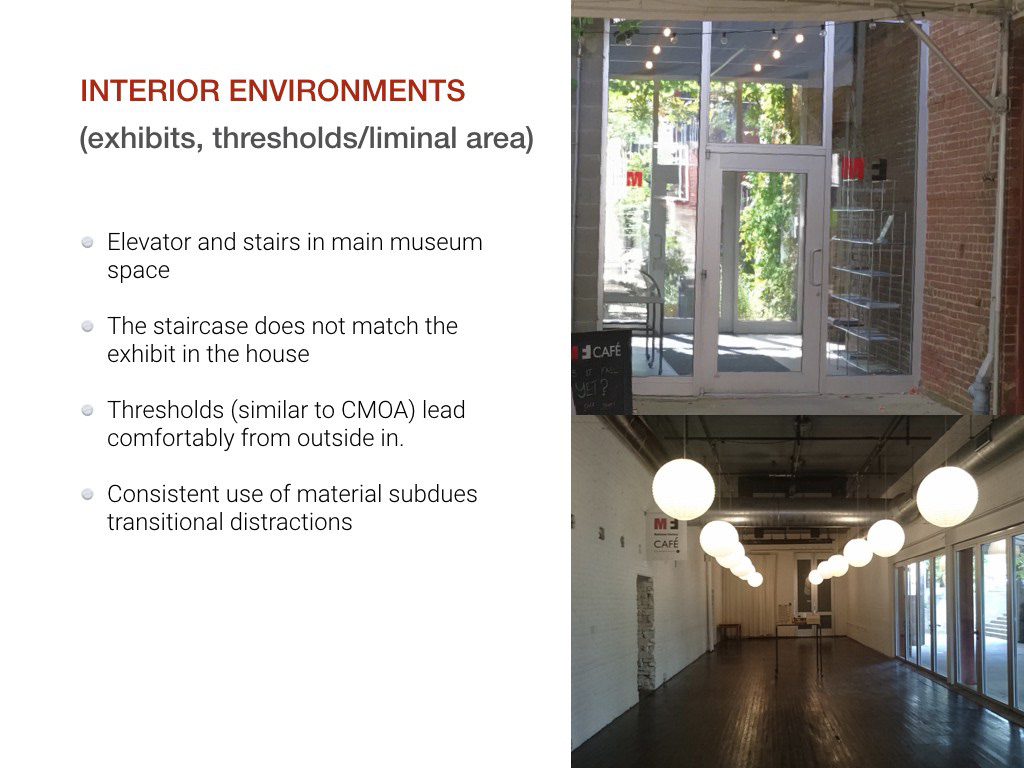
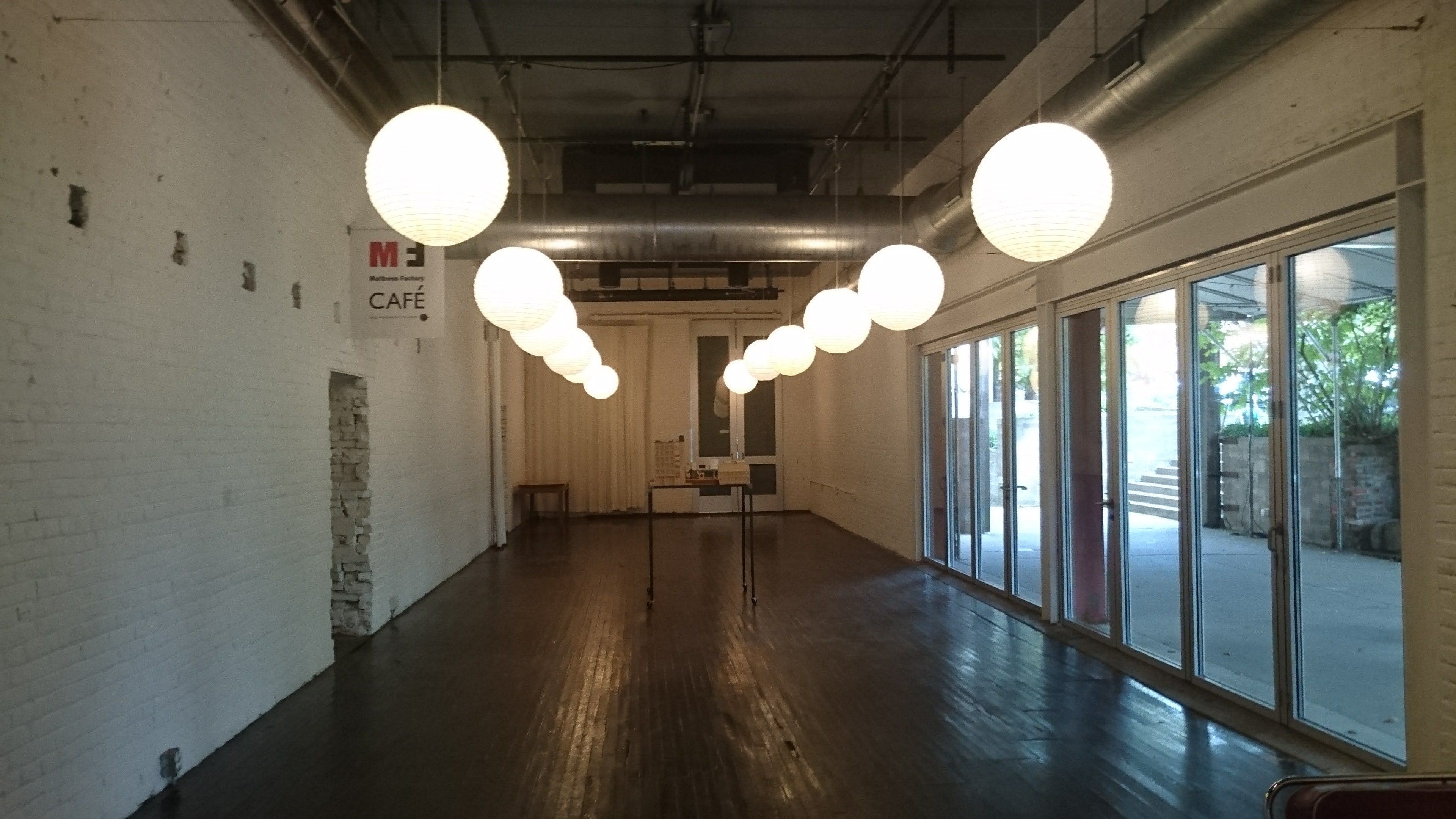
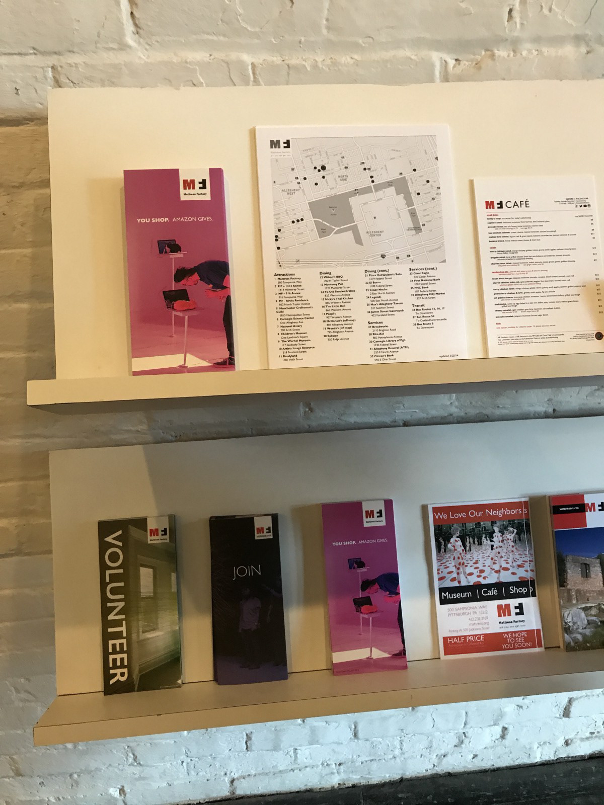
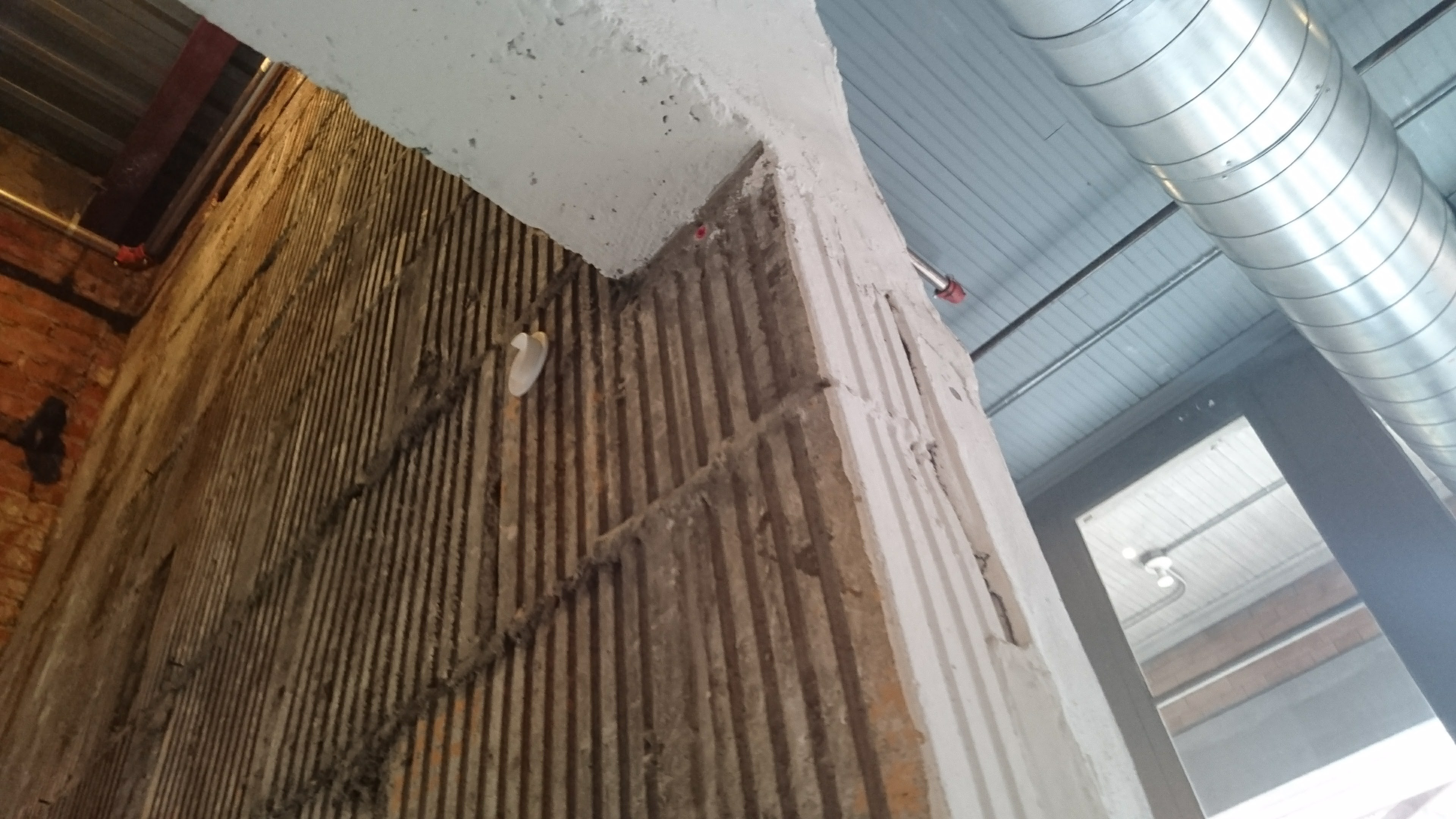
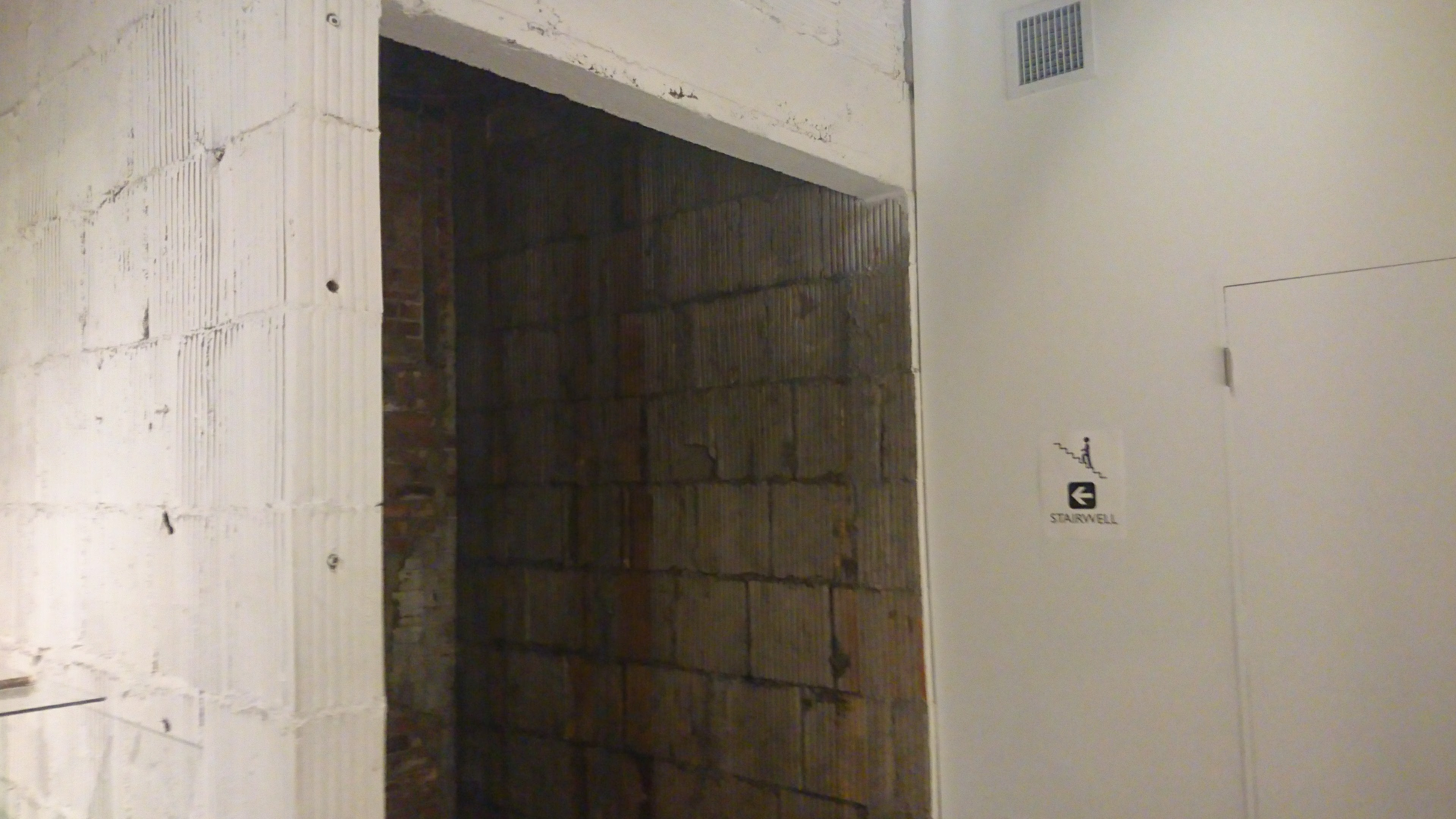
Upon entering the museum, a visitor is met in a small landing room equipped with a display case and brochures promoting the museum. With a door on either side, this room serves as the first threshold to pass through before officially entering the museum. This is further emphasized with the transition from red brick to corrugated cement as well as natural light to artificial. Passing through the cement corridor, the lobby opens up and the visitor is greeted the desk before them. The modern space is furnished with trendy couches and coffee tables amidst dark wooden floors and painted white brick walls. Signage exists at varying sizes to help guide a user through the museum, however it is the employees that will most likely tell you about the other museum buildings.
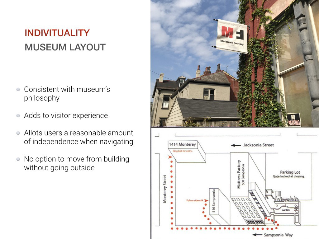
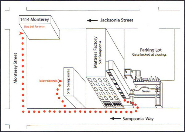
As per the employees suggestion, we visited one of the external museum exhibits west of the main building first. In order to get to this part you have to walk down the street to the building. There is no way to get from one part of the museum to another without going outside. The separate buildings evokes a feeling on individuality and independence, that could be said perpetuates the museums philosophy of supporting independent art. To help visitors navigate between buildings, there is a simplified map on the back of information exhibit sheets distributed around the museum. Like the main building, a visitor is greeted with a desk and an employee with information on the exhibit.
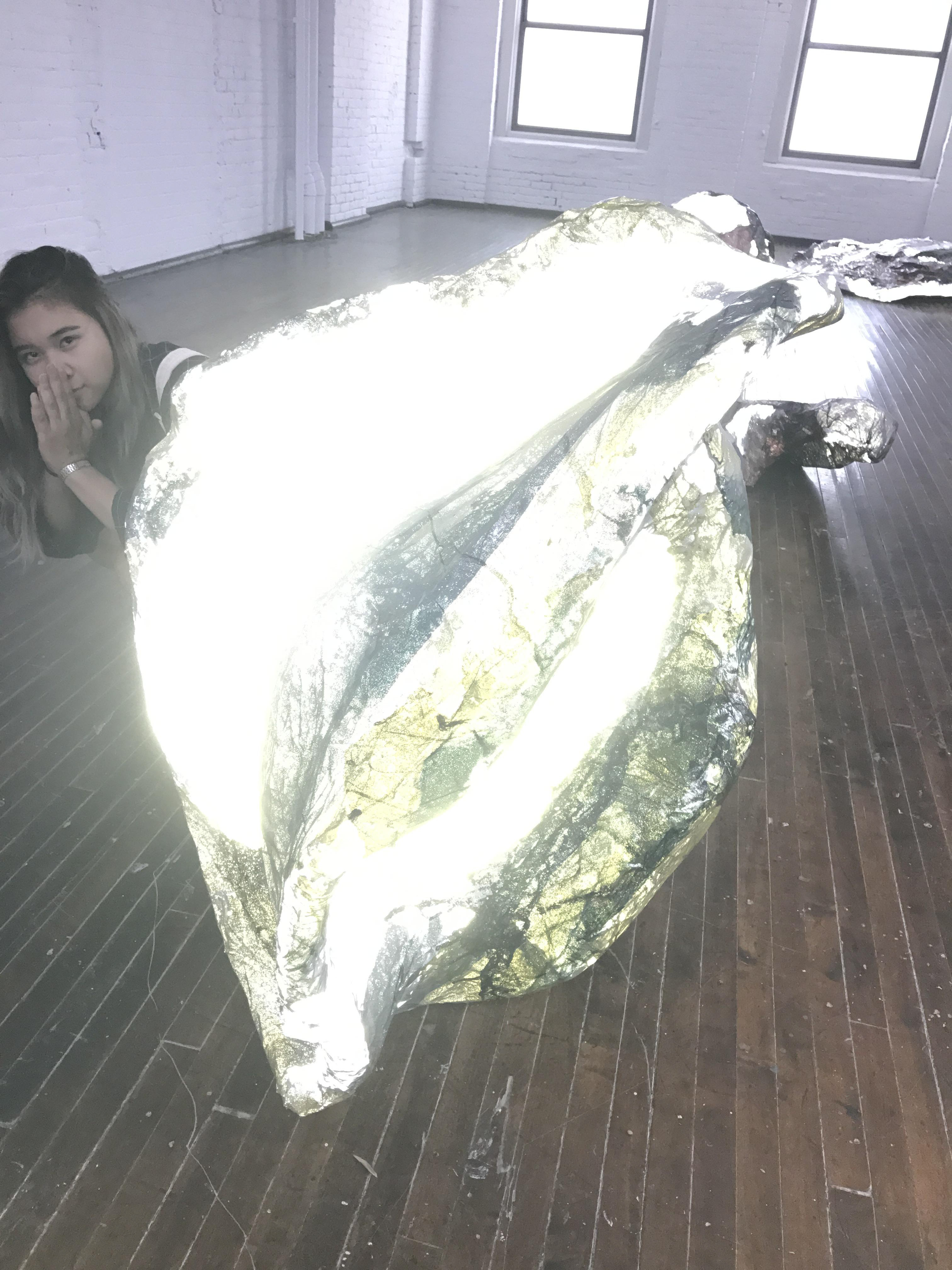
The Dennis Maher House
At the Second Home exhibition, the woman at the front desk informed us that it was a reservation only exhibit but because we were the first customers that day we were free to go.
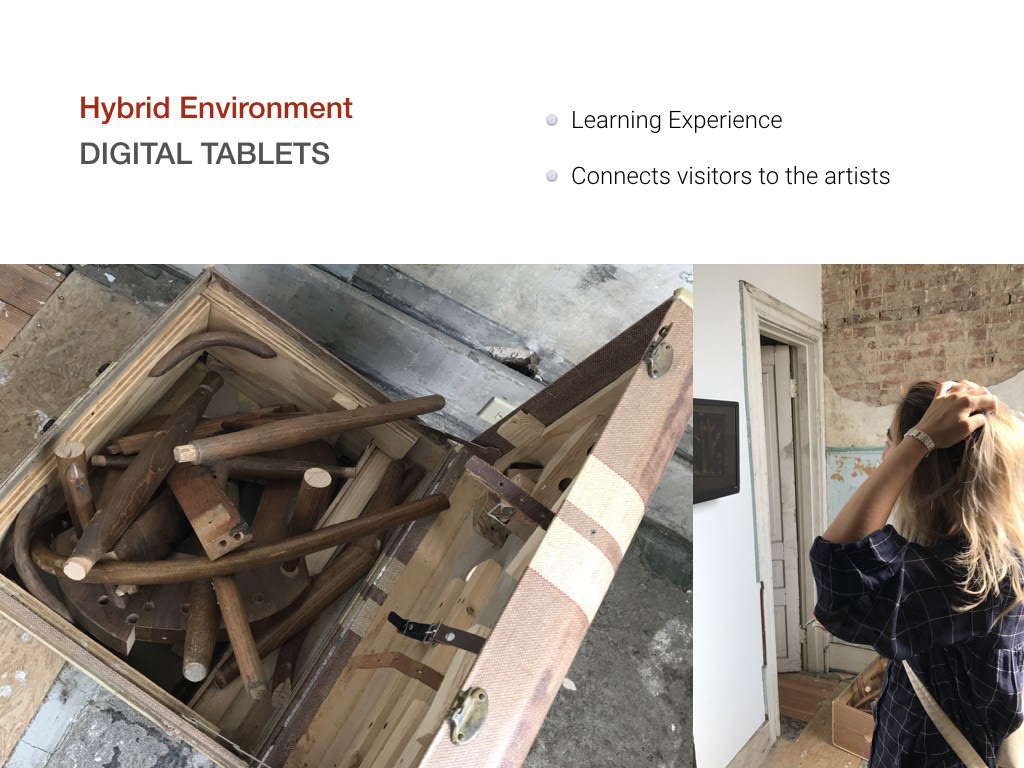
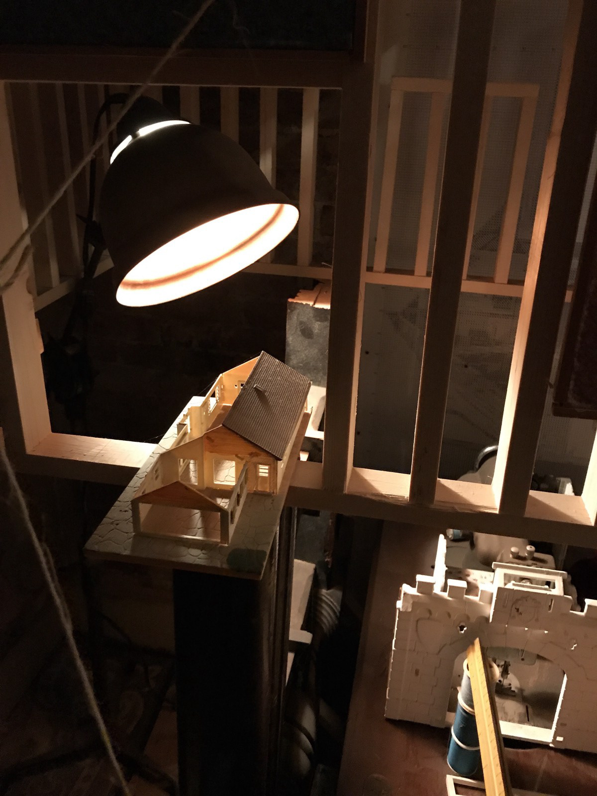
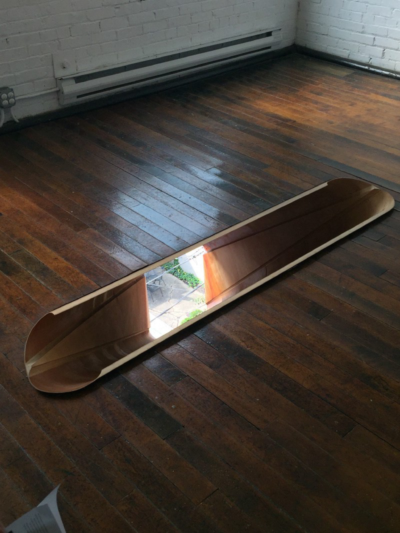
First impression of the exhibit was influence mostly by the sound and look. Immediately noticeable is all of the wood creations in the house. almost all of the sculptures in this space where made of wood, as was the floor which you walked on. While ones taking this in, there's a track of individual piano keys playing. So from the strange and imaginative creations within the space and the foreboding sounds enveloping you, it gives off a very ominous feel. There are also many steps within for no apparent reason. On the first floor the steps only go up or down One step which occurs frequently. As one moves up in floors the amount of steps up and down increases within the space.
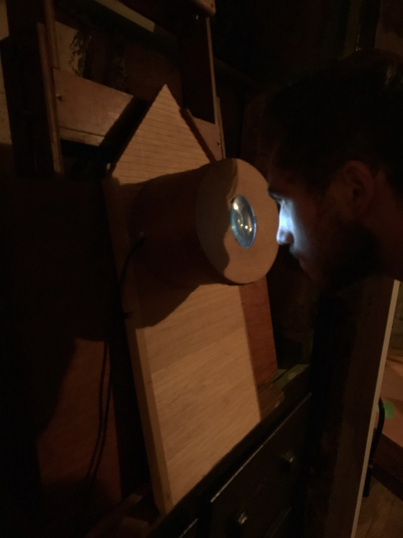
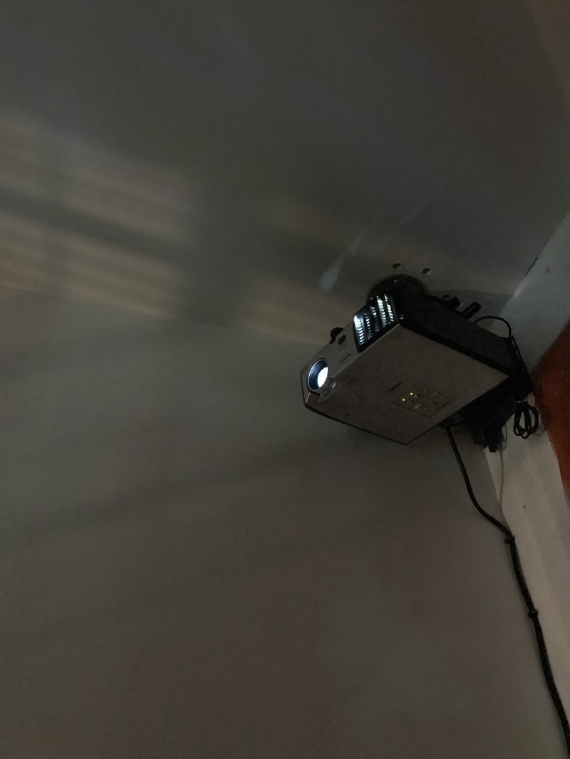
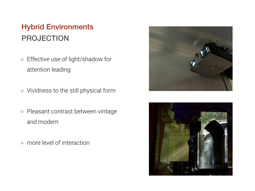
In contrast to the wooden material throughout the exhibit, in almost every room there is a digital aspect. On the first floor there is a microscope like illumination that when one looks into you can see a handwritten note. Further on there is a projector projecting down onto a table where you can sit down at. The digital elements didn’t feel out of place however and meshed with all of the wooden creations well.
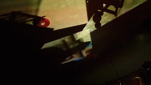
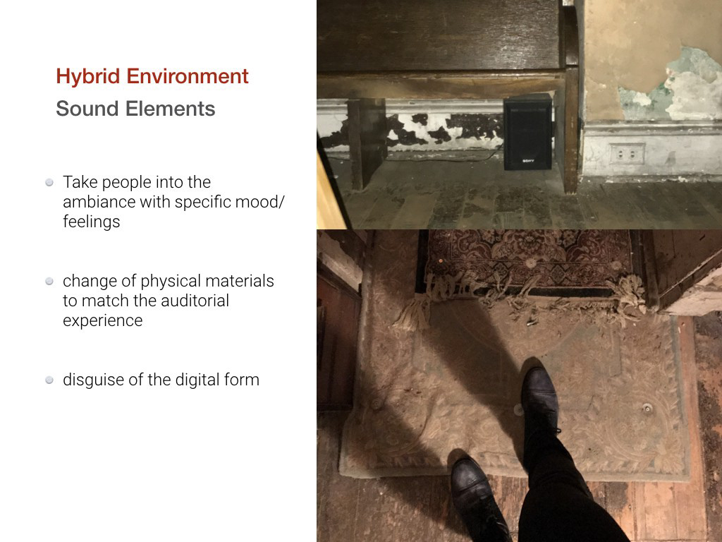
One of the findings I had about this space was that everything heightened as you moved up through the building. The sound when you get to the second levels get louder and new sounds of industrial work is mixed in. Then on the third floor this becomes even louder than previous floors. As one moves from one floor to the next, they may notice that the steps withing the space become longer. The first floor is just one step up and down, the second floor ranges from one to two steps up and down, and the third floor had steps that go three to four steps up and down. This space is also not meant for any disabled as there is no way for anyone with a physical disability to move through the space comfortably. The digital aspects as well also increase. Projectors are used a lot in the top floor in comparison to the singular small one used on the first floor. Every floor feels like a heightened version of the previous floor and this is because of those subtle transitions between each.
Some problems that we noticed in this space was accessibility, transition, and learning experience. For someone in a wheel chair or crutches, moving through this narrow space with many steps up and down is impossible. This is a flaw but it’s also something the artist can’t control if it’s part of the meaning that goes into this piece of art. The transition between floor to floor is very disconnected. When you get to this steel door with signage on it, it takes you away from the exhibit. This also creates a disconnect between each floor which may be part of the exhibits meaning or, as it seems, an un-thought of flaw. Next is the learning experience. Never during this exhibit is there any information or signs that inform the viewer of the spaces intent or purpose. You’re left wondering what the point was of the exhibit and how every element played a part.
The Main Museum Building
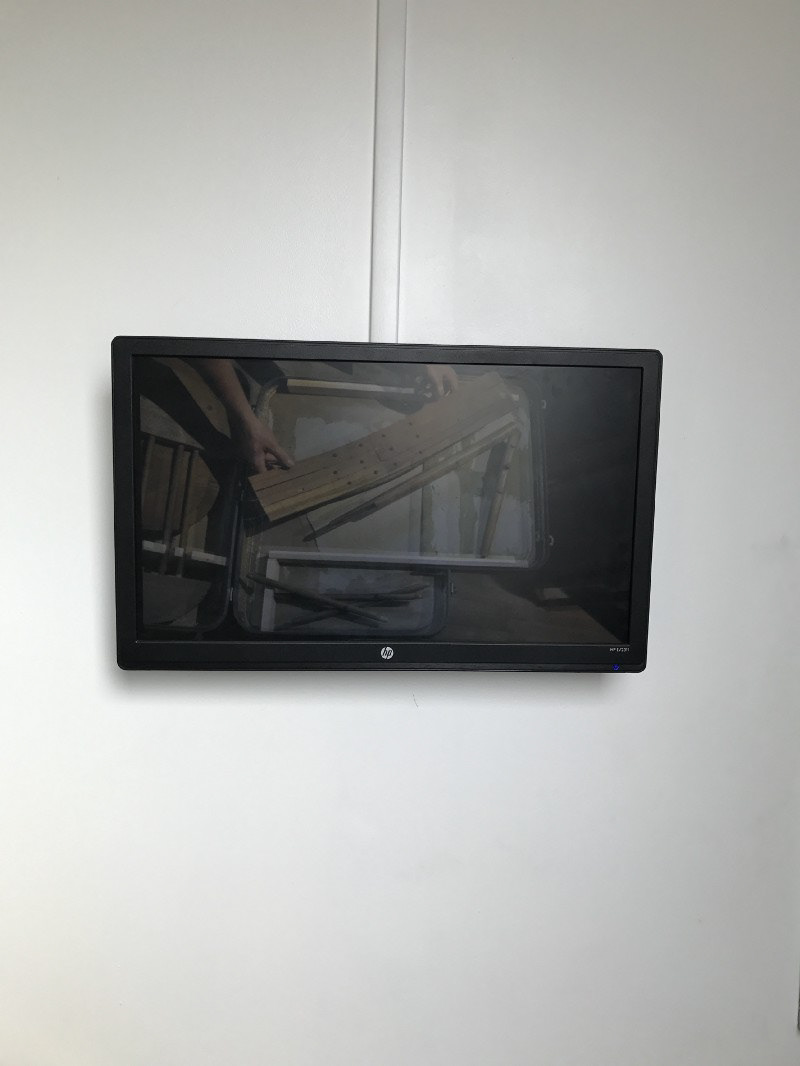
After visiting the Dennis Maher House installation, we travelled the same path back to the main building. Having already traversed the thresholds of the main lobby, we comfortably breezed past towards the elevator. While waiting for the elevator, we noticed that there is a white shelf against the wall with all different kinds of flyers and brochures about the Mattress factory displayed, brochures including navigation guide, volunteer application, shop promotion and exhibition info etc. However, while there are more than 15 different brochures/map displayed, there is no clear organization and hierarchy within the display. Thus it is difficult for visitors to decide which to pick up or even if the brochures are relevant to their interests.The map of the exhibition is placed between the information museum cafe and museum shops. On top of the shelf, there is television that displayed, showing the different slides of the exhibition in the museum.
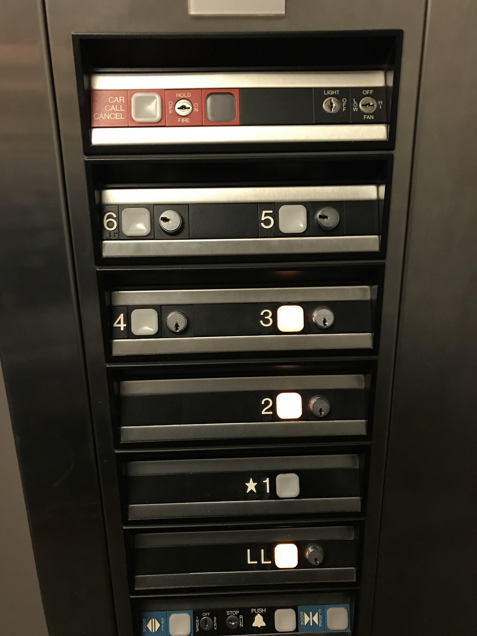
Lacking a clear sequence of exhibits, the museum leaves it up to the visitor to decide which floors they wanted to start on. we decided to go from the top floor to the bottom floor. However, only until when we are in the elevator and pressing floor buttons, we realized that above fourth floor is all unavailable. This is unexpected since there is no obvious notice about constructions prior to our entering the elevator.
Material and Color
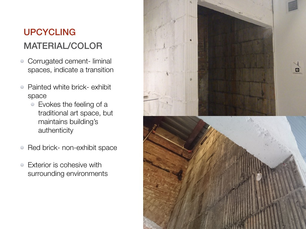
Material choice plays a significant role in defining thresholds and boundaries all throughout the museum. The corrugated cement is rather consistently used to indicate thresholds and liminal spaces (transition from vestibule to lobby, gallery space to stairwell). The museum does a good job of utilizing material to indicate different spaces in that brick is used throughout the building, but within exhibit space, it is painted white and left its natural red outside.
Learning experience/Interaction
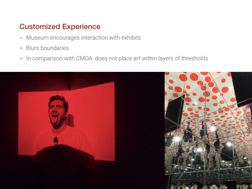
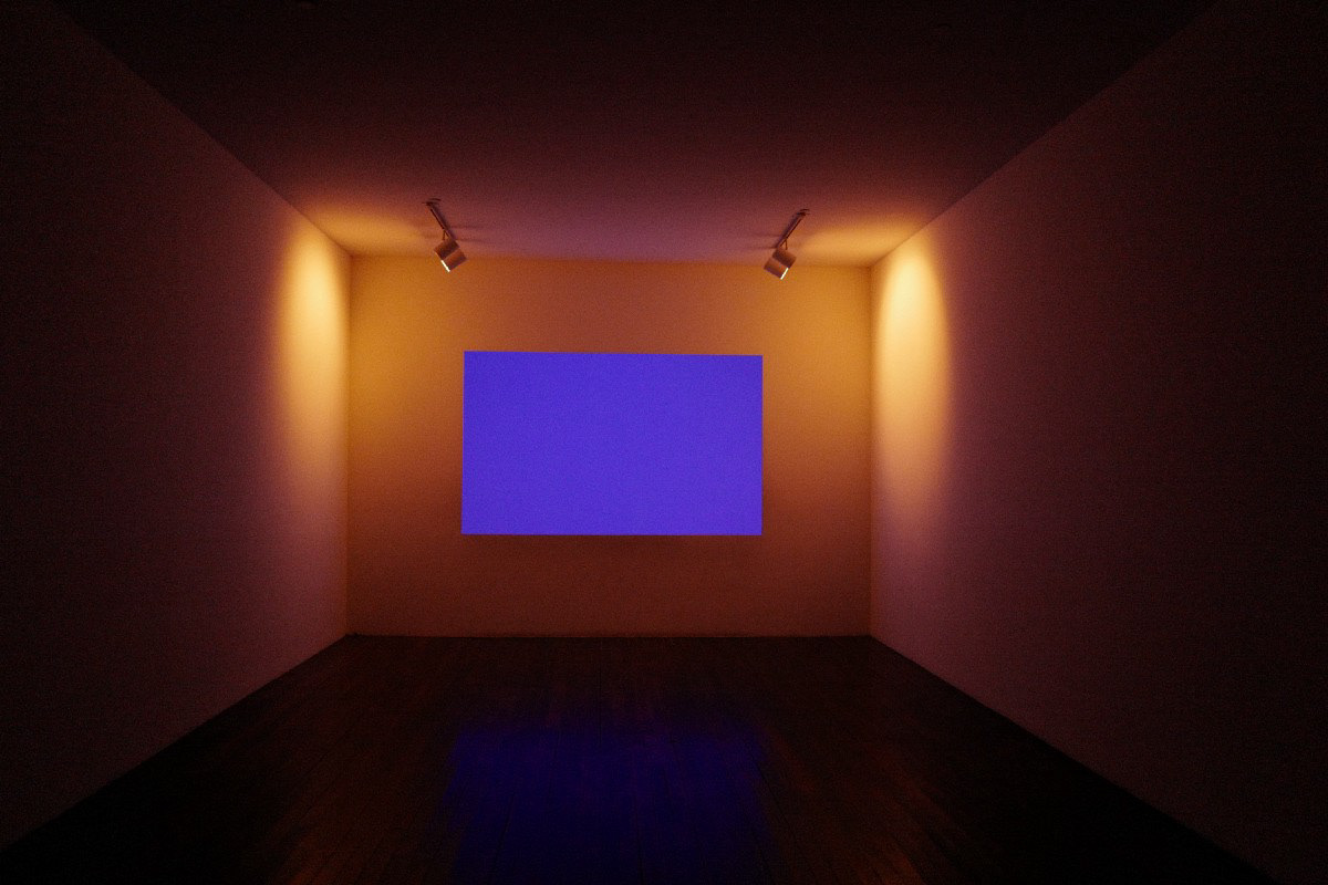
While travelling through the main building’s exhibits, we found that the focus was very much geared towards a user and a piece’s joint experience. In contrast with CMOA, where there very clear boundaries and thresholds surrounding each art piece, The Mattress Factory wants an individualized interaction with each visitor. Exhibits such as James Turrell’s “dark room” and Yayoi Kusama’s “dotted room” allows a higher level of interaction that visitors will fully involve in the environments, where the experience become part of the art itself.
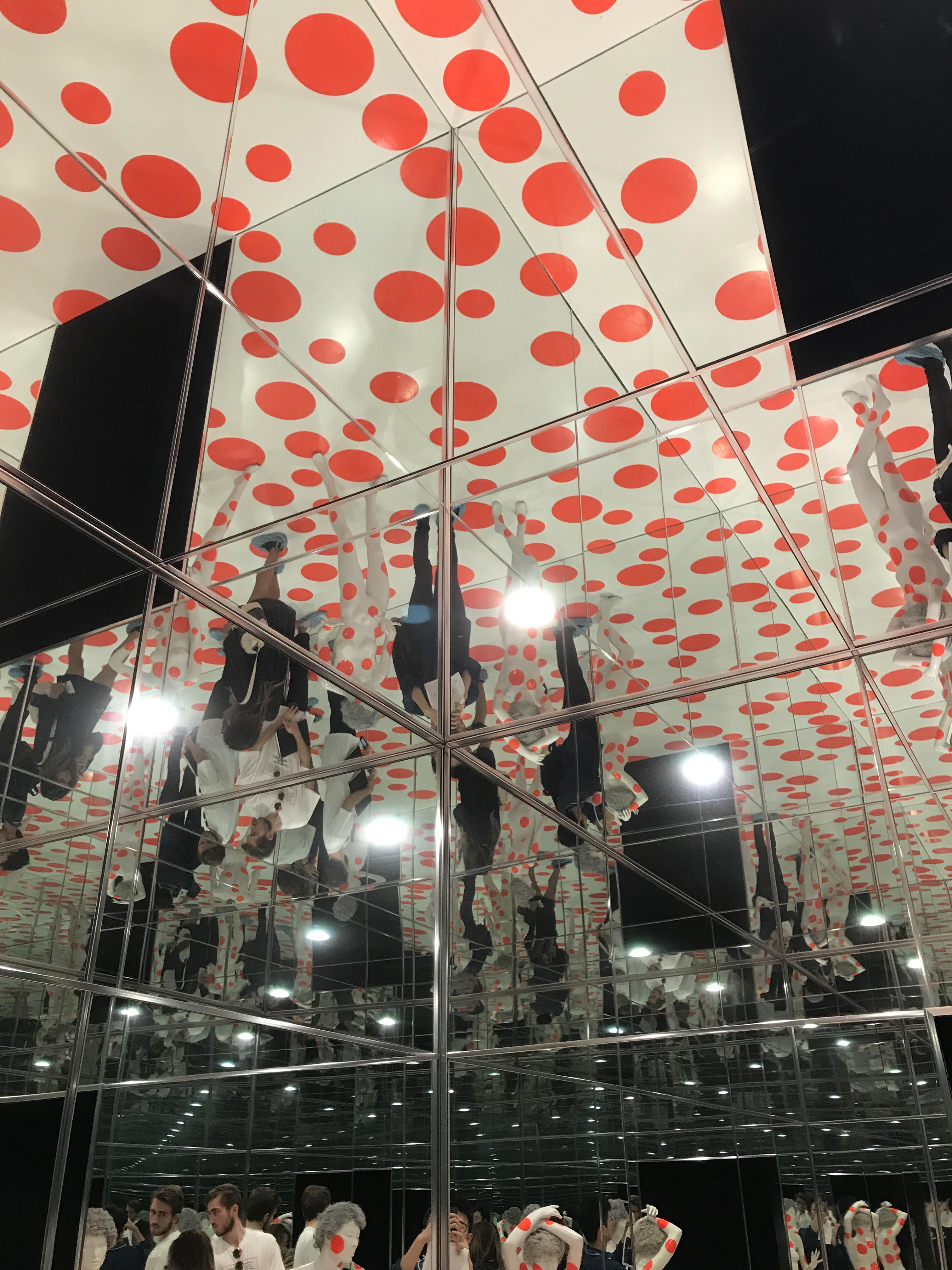
Some exhibits also include the digital aspect of interaction, such as there is an installation made by some special reflective materials for flash photography. So visitors can visually interact with the art piece both physically and digitally
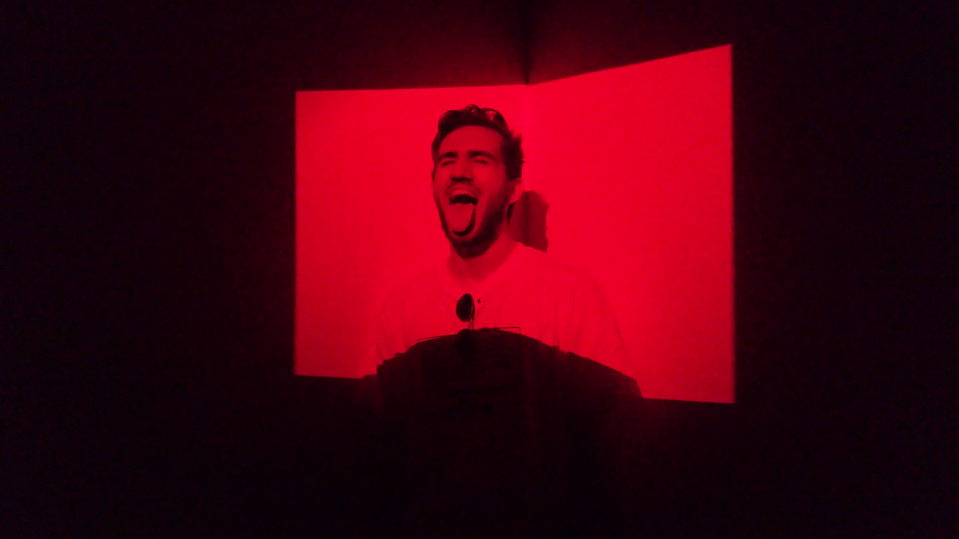
One explicit methods that the museum provide for learning is to having staff members presented in some exhibition. Instead of wearing the guard-like uniforms, the staff that in the Mattress Factory exhibition are much more approachable. They will inform the visitors and suggest ways to interact with the exhibition for better visiting experience, such as providing directions in the “dark room” of James Turrell.
Problems
Floor navigations(some floor is not accessible through elevator )
Lack of In-depth learning experience
No clear path for visitors to follow
Unclear which parts of the museum are accessible and which aren’t